
Emergency Safety App: Built for the moments when seconds matter
The Problem
Panic doesn't read menus
ZoneAid is an emergency response app: a way to get real help moving toward you within seconds of realizing something is wrong. This is the first version I designed and built, not a redesign of an existing product.
In a real emergency, people don't have the composure to navigate menus. Hands shake, thinking narrows, and every extra tap is a tap not spent getting help. Most emergency apps are designed for someone calm enough to read five options and pick the right one.
I needed ZoneAid to work for the version of someone having the worst moment of their life: scared, rushed, and possibly unable to see clearly or use both hands.
Cluttered menus
Traditional emergency apps buried the SOS action behind categories and settings.
No time to think
Every extra tap costs seconds that matter most in a real emergency.
Fails when it’s needed
Apps that need a strong signal or a calm mind don’t work in a real crisis.
Silence after the tap
No confirmation that help is coming leaves people more anxious, not less.
1. One-Tap SOS
The issue
Traditional emergency apps required navigating menus and creating an account before help was even requested, costing precious seconds.
The fix
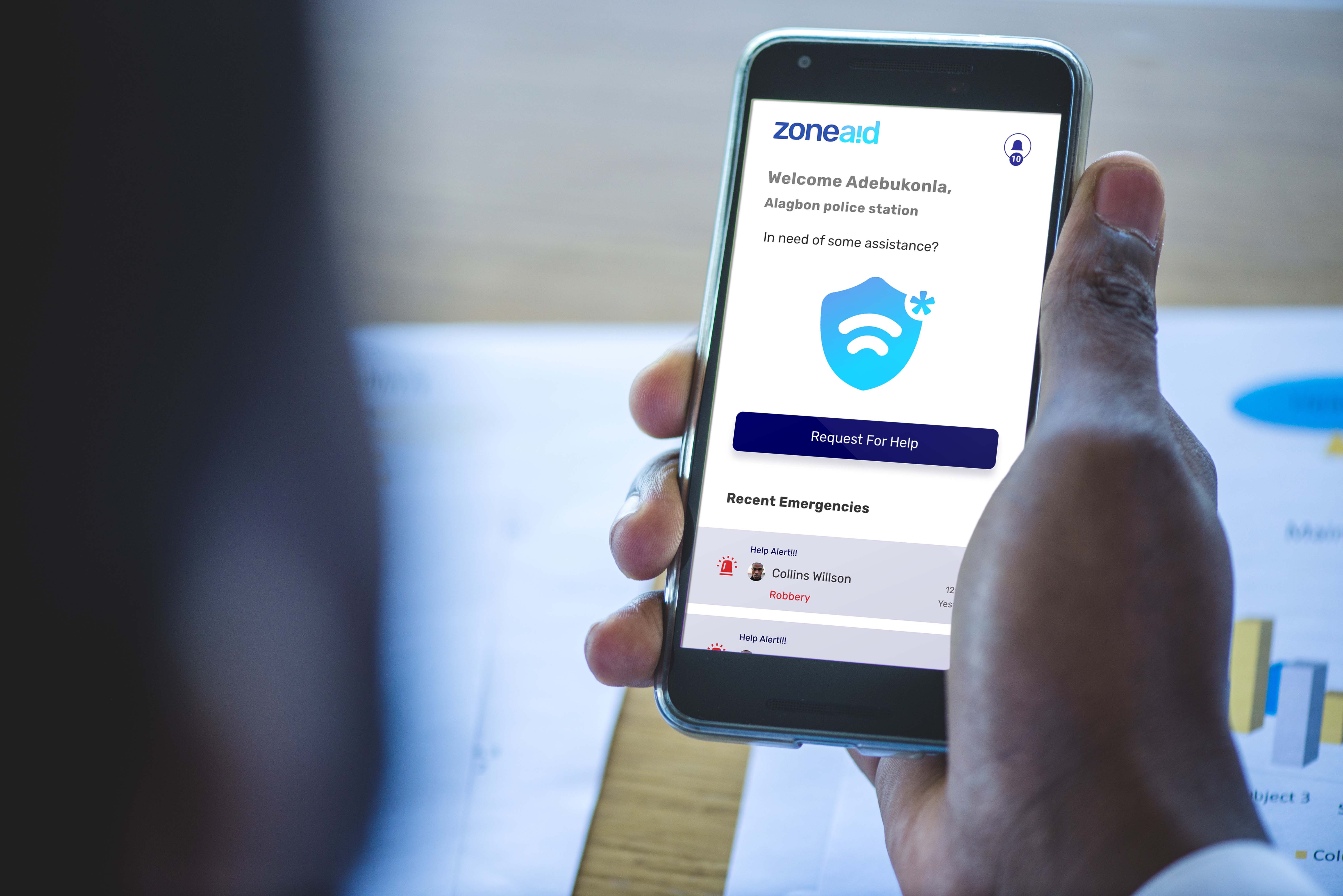
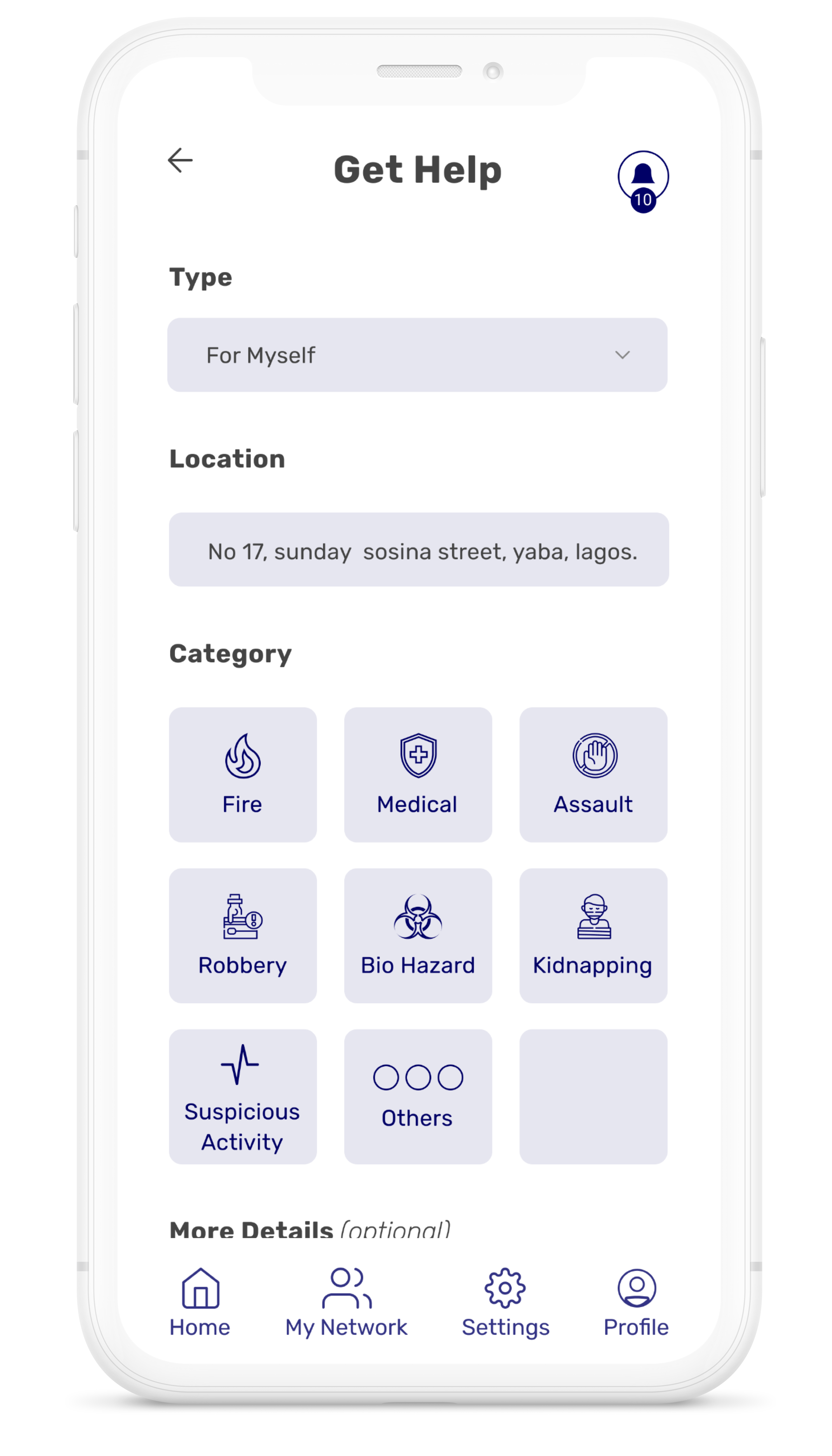
I designed one dominant SOS button that starts the emergency flow immediately. Category selection is optional and can happen after help is already on the way, cutting the flow from 5 actions to 2.
2. Voice Notes, When Typing Isn't an Option
The issue
Typing details during a crisis is slow, sometimes impossible: shaking hands, one free hand, or a screen someone can barely see.
The fix
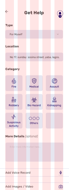
A voice note option built directly into the help request, so someone can speak what's happening instead of typing it.
3. Live Status, Not Silence
The issue
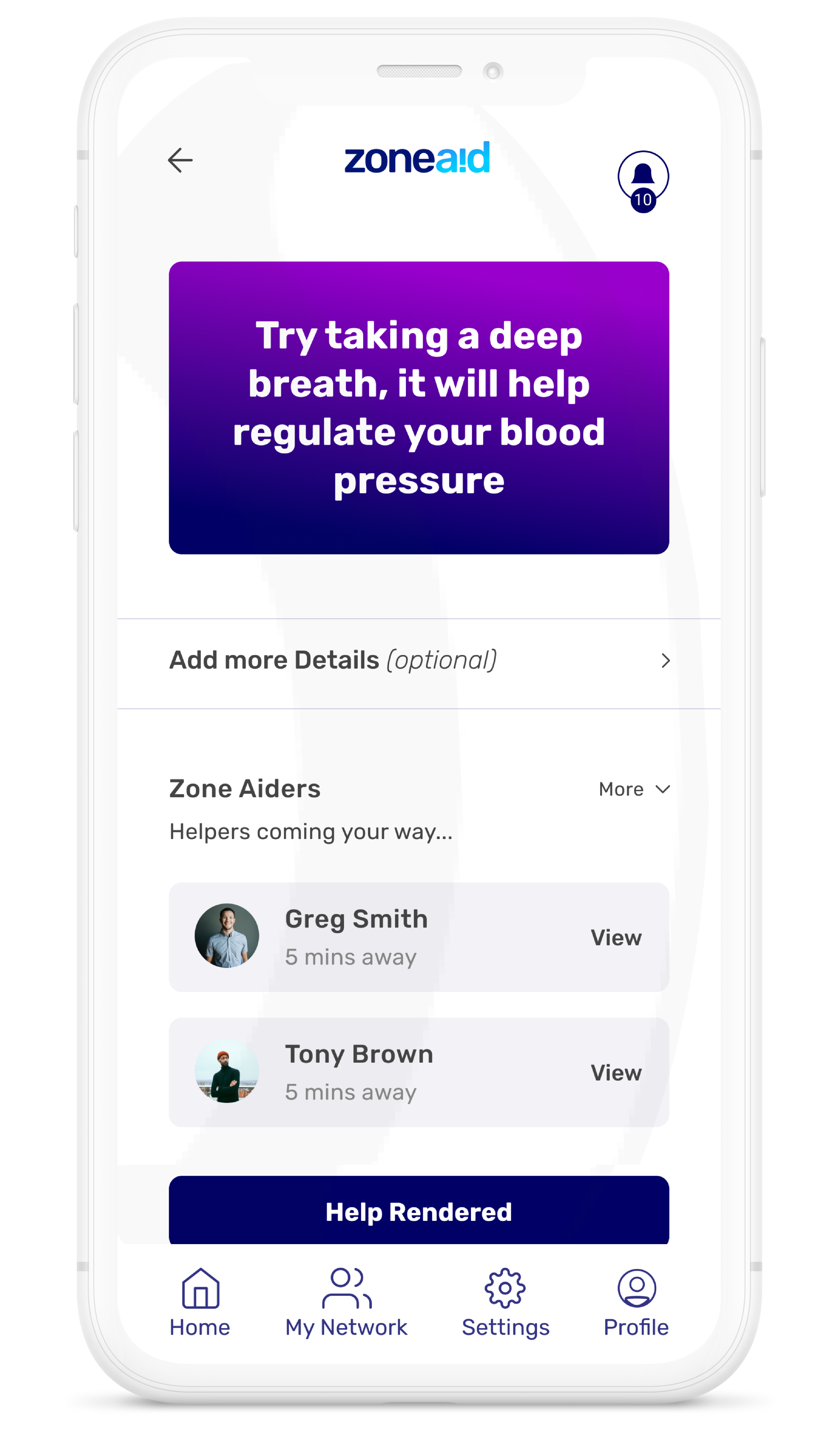
After tapping for help, the screen went quiet. No confirmation, no sense of whether anything was actually happening.
The fix
I built a live status screen: searching for help, responder found and en route, or automatic fallback, so the wait itself feels handled.
4. Works When Everything Else Fails
The issue
A single point of failure: if the network dropped, the whole app stopped working.
The fix
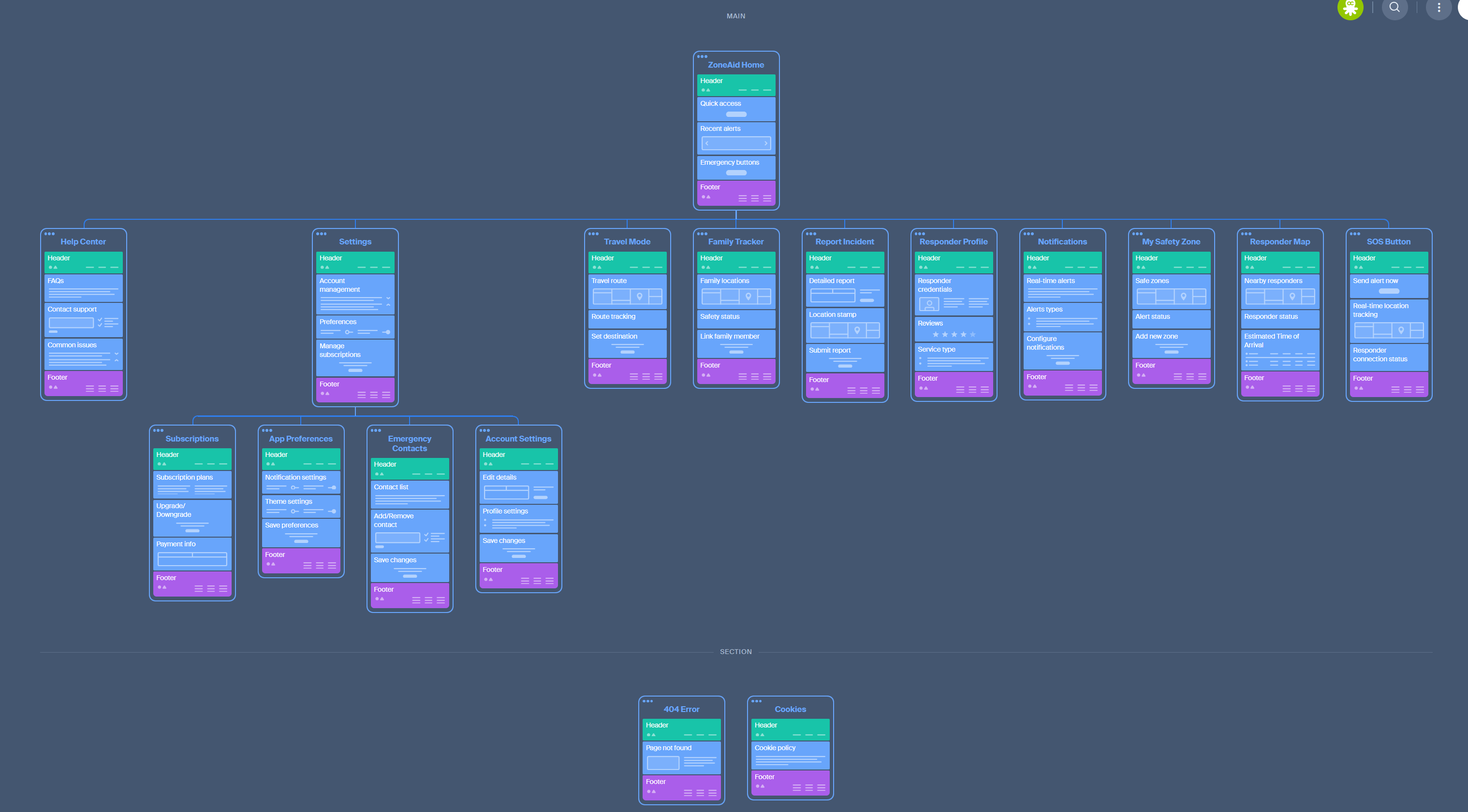
I split the system into three layers: an Emergency Core that works fully offline, a Support layer for family alerts once connectivity returns, and a Maintenance layer for calm-moment setup.
Prototype tested under simulated stress conditions
5. Built for Shaking Hands
The issue
Small buttons and low contrast are hard to use even when calm, and nearly impossible under stress or in a dim room.
The fix
I built a 120pt SOS button, pushed contrast beyond WCAG AAA, and tested one-handed thumb-reach placement across grip styles and emergency scenarios.
Before and After
Same Emergency, Fewer Steps
BEFORE
- 1Open app
- 2Navigate menu
- 3Create or verify account
- 4Select emergency category
- 5Confirm
- 6Help requested
AFTER
- 1Open app
- 2Tap SOS, help requested automatically
- 3Category and details added after, if needed
I didn't build a new dispatch system or new emergency services. Just fewer steps between panic and help.
Impact
What Changed
40%
faster emergency response time
98%
success rate in user testing
3s
average time to connect to help
Reflection
Design for the worst day, not the demo
I learned that designing for someone's worst moment is different from designing for a good day. Every extra tap, every unclear label, every silence after an action becomes a real cost when someone is scared and rushed. Designing for that state made the ordinary experience better too: fewer menus, clearer feedback, one action that always works.
Back to Projects